

Yay! I came in 2nd again. I lost to the same person. LOL
Original picture here.


Vid Overall Scores: 132.5 Total Competition Scores: 368.5
Photo 1
Style: 9/10
Presentation: 4/5
Concept: 5/5
Execution: 3.5/5
Total: 21.5/25
Comments: This was a big improvement over the last one, however there was just a few things. The guy's pose really didn't seem to flow with this photo. I'd expect something more fierce. This seemed more like a "good guy" pose. The skid marks look really off. They should have been wider apart and maybe a bit wider to be more realistic. I also felt the helmet was not needed. It's a bit of a distraction and looks to be just filling a place. The clothing was much better as was the lighting and I really like the set.
Style: 9/10
Presentation: 4.5/5
Concept: 5/5
Execution: 4/5
Total: 22.5/25
Comments: I think you really did improve from the original! Once again, I loved your styling. (Especially since you used different boots on your female model.) Just a couple comments. I thought the skid marks were a little weird since the proportions were off since they didn't match any vehicle (that I know of anyway...lolz!) And I still didn't like the pose on your male model. I didn't think it fit in with the tone of the overall photo. But otherwise it was a big improvement!
Photo 2
Style: 8.5/10
Presentation: 3.5/5
Concept: 5/5
Execution: 3/5
Total: 20/25
Comments: This one really wasn't your best. The background took up a lot of room with things on either side of her that don't frame her nicely. The camera guy kneeling down is a bit awkward as far as positioning and where the camera is pointing. I am also really not a fan of the text for the ad. Overall, it was an okay photo.
Style: 8/10
Presentation: 4.5/5
Concept: 4/5
Execution: 4/5
Total: 20.5/25
Comments: This was an okay photo. I just wasn't really wowed by it. I felt that maybe it was the fact that your backdrop took up almost the whole photo. I also thought that your model's hair wasn't as glamorous as he dress, so it looked a little sloppy. Also,be careful where you position your extras. The one camera guy kneeling looked like her was taking photos of her butt!!
Photo 3
Style: 10/10
Presentation: 4.5/5
Concept: 5/5
Execution: 4/5
Total: 23.5/25
Comments: I really like this. The background is stunning. Love the use of the mirrors. The pose hides part of his face which I wasn't a fan of. I also think the use of the in game effects was unneeded and more of a distraction, but overall it was a really great photo.
Style: 10/10
Presentation: 5/5
Concept: 5/5
Execution: 4.5/5
Total: 24.5/25
Comments: I love this photo so much! I loved the colors and the mirror effects. I liked that your lights looked like snake skin, I dunno if that was intentional or not, but totally a cool effect. My only comment its that the pose you chose kind of blocked his face. But other than that,it was an amazing photo!
Chelle beat me again! She won SNTFM and now this! o_o I don't mind. I rushed to finished this competition too, but I did have a little more hope for this one since I was in the lead and liked my pictures better for this.
I didn't particular like the remake of my first picture. I knew I wanted to use my first ad for the remake assignment, but I couldn't quite get the styling and poses right for it. The poses I did have in mind needed the Fast Lane Stuff Pack for the accessories to work and well I don't own any stuff packs. >_< That alone f*** up my creative process for this and I had to switch stuff around. I also believe that I drew big ol blink when it came to the male model's look. Mostly his hair. If I had more time, I would of took my time planning out his look more. It just wasn't what I envisioned for my remake.
The 2nd picture and ad for Sims Corp. was an idea that came to me on the very day the whole thing was due. I really love the old Hollywood glam look, so I just went with it. I personally like this picture as it's a mixture of advertisement and modeling IMO, but I do think it could of been improved just a bit. The camera guy bending down does look awkward and I would of used fancy text if I wasn't in such a rush, but I like the ad other than that. I don't know how great it would of looked if the backdrop wasn't taking up the whole photo. I guess I could of maybe build a Hollywood setting around it, but I did what I could.
Then my final picture was completely rushed and down to the wire. I knew I wanted to do a D&G Ad, because I think all their ads look amazing and unique. It was just creating something to mimic one of their ads with limited time that became a problem. :/ I do like this picture, but I feel like I could of even pushed envelope more and did something even more insane with more time. As for the critiques, the lights were placed there to keep it from looking so boring and the pose was the only pose I had that looked interesting in such a simple setting. With more time I would of even had more mirrors and props. Oh well! It turned out better than I thought at least. Ha, it was liked more than I thought too.
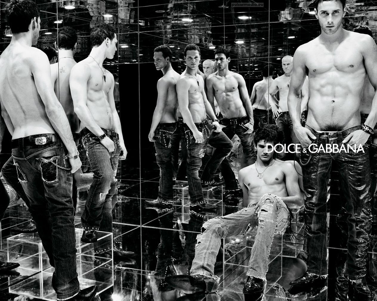
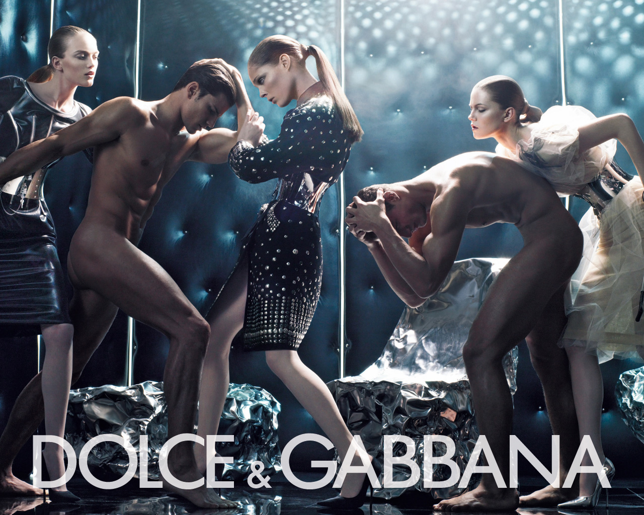
These are the DG ads I was trying to copy:
http://www.wallpaperslot.com/data/media/523/DOLCE%20&%20GABBANA%20%2036.jpg
*nudity alert* http://www.wallpaperslot.com/data/media/523/Dolce%20&%20Gabbana%20Winter%202007%204%20%20Fashion%20Wallpaper.jpg
So after being defeated twice in a row, I think a break is needed. lol I do have one other comp I'm waiting for scores for, but that's about it for now. I'll take my professional runner-up badge and wear it proudly. Maybe one day I'll get the crown again. xP
No comments:
Post a Comment